Unexpected similarity
The previous articles shows that there is some visual order in the world of crazy 2nd order roulette curves. I particularly like the bottom rows of the survey grids: when the curve parameter T3 is smallest possible: T3=T1+nsymm. What I like is how lobes are sticking out from the center. But when I was trying to get more of that, with different cuts through parameter space, I noticed an unexpected similarity between curves. Here is an example cut with T1 on x axis, and T on Y axis, while I fixed T3=T1+nsymm and rotational symmetry nsymm=7 (click on the image for larger version):
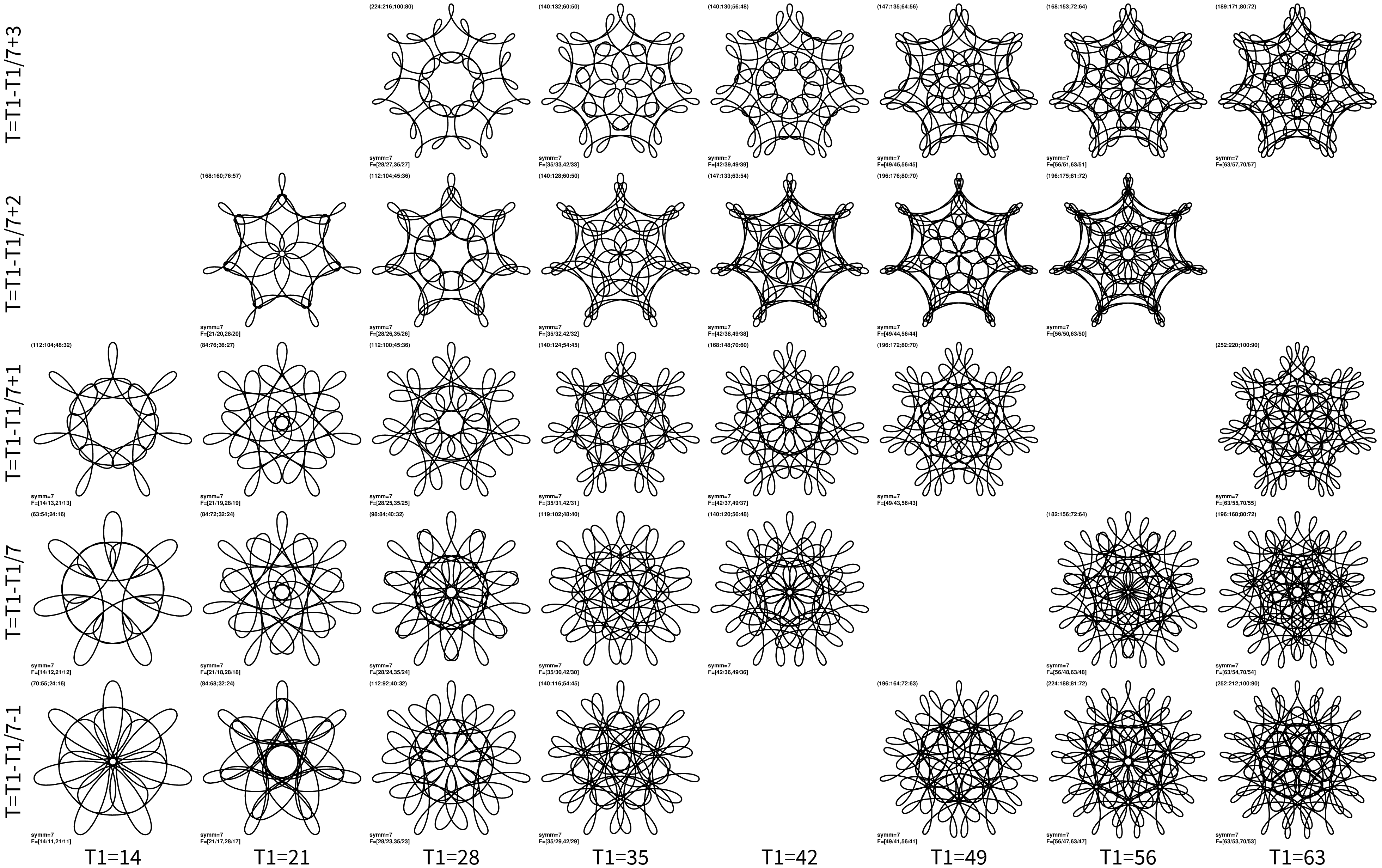
The missing panels are either because parameters do not satisfy T<T1<T3, or T contains a factor that divides both T1 and T3. The rows are very very similar. Each successive panel looks like the previous one, but with one more line added in consistent way to the rest.
Each row of such similarity can be described in a following way. For a given curve F=(T1/T,T3/T) and rotational symmetry nsymm=gcd(T1,T3), there are similar curves with:
T1’ = T1 + k ⋅ nsymm,
T3’ = T3 + k ⋅ nsymm,
T’ = T + k ⋅ (nsymm - 1),
where k is arbitrary integer. Though some combinations of k vs other parameters will not be possible; either because of T’<T1‘<T3’ or T’ should not contain a factor that divides both T1’ and T3’. The equation is valid for nsymm=1 as well.
The above expression can probably be proven in a formal way, but I think it is clear what happens: We are literally adding another line to the design and forcing it to “beat” in the same way, or in other words have lobes in exactly the same positions like in the original pattern.
Such similarity is there for all curves, though it may not be always too obvious. For instance this is cut for T3=T1+2nsymm and nsymm=7:
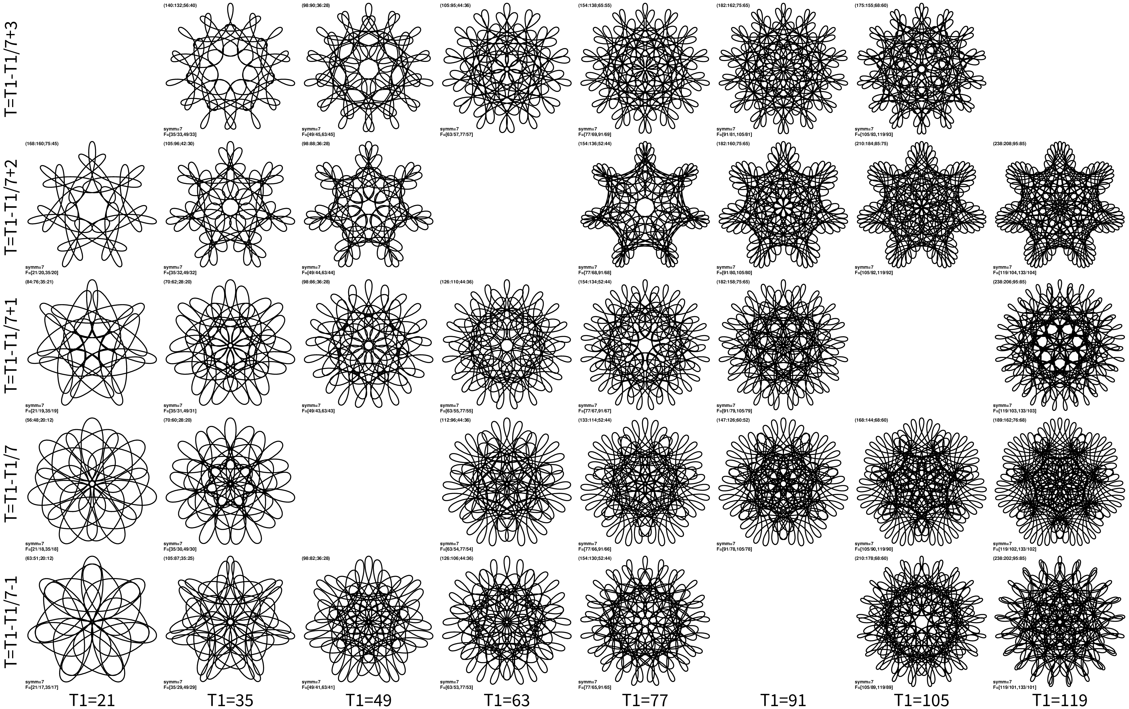
Panels in each row resemble each other, especially when contrasted in such a way. But what is even better is to contrast the two images: each panel at the same (x,y) position in both plots resemble each other. That is because of the (weaker) similarity of nearby T3 parameters: as utilized in the survey article.
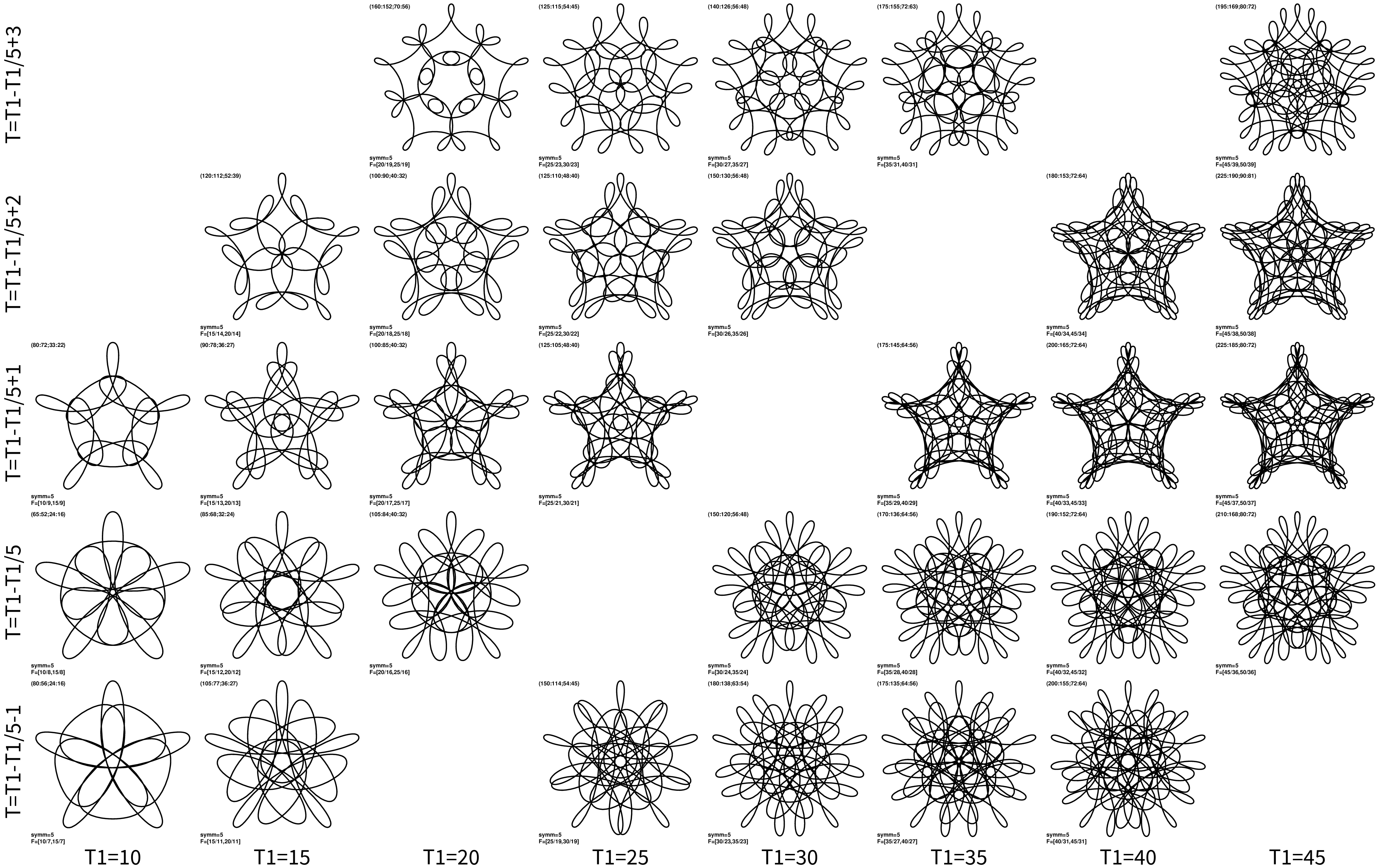
I find these curves just marvelous. So two more plots, T3=T1+nsymm and nsymm=5:
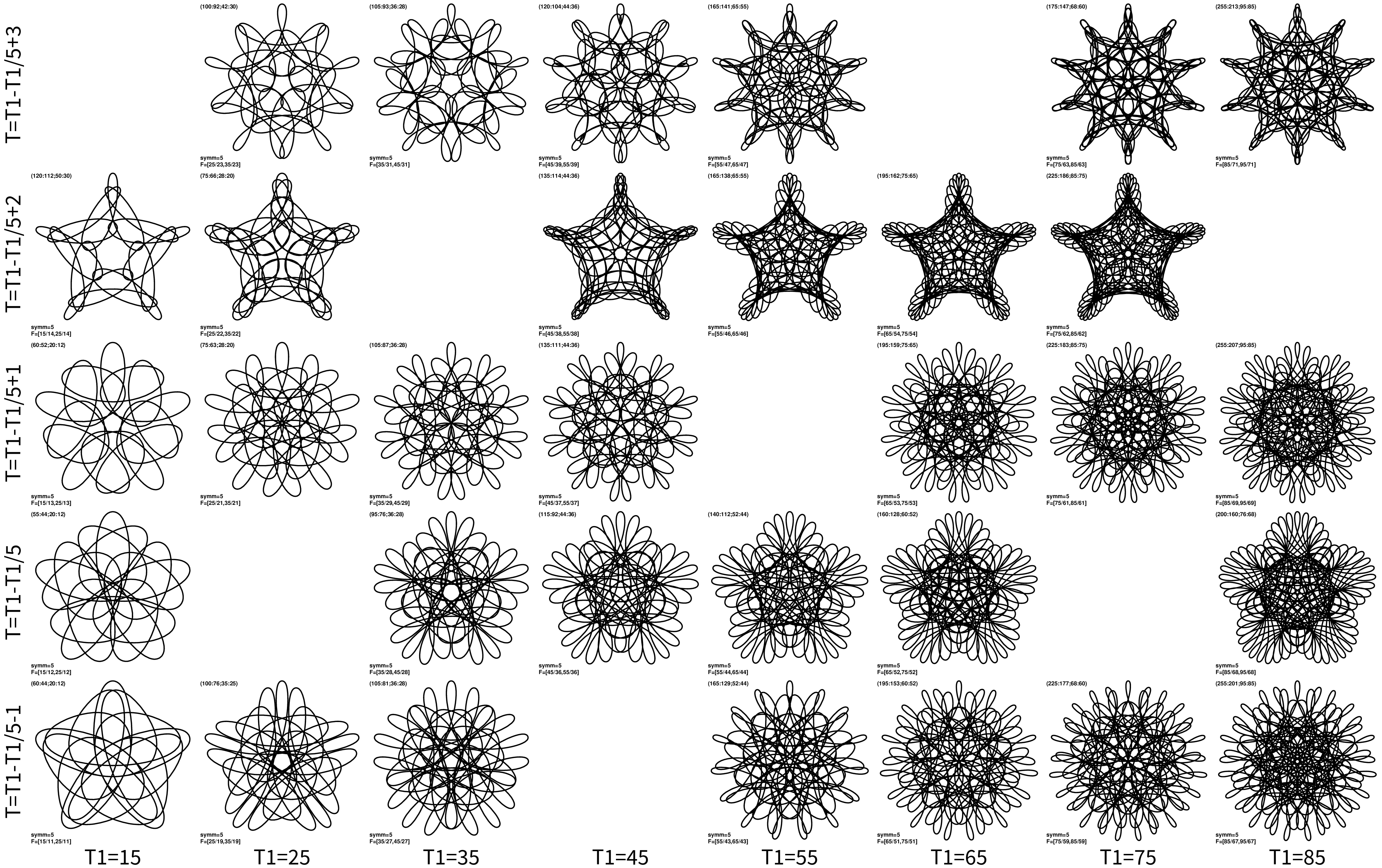
and T3=T1+2nsymm and nsymm=5:
I suspect that there is even a better way to show all such similarities compared to my initial prod in the the survey article.
As a last note: it is becoming increasingly difficult to match these kind of designs on paper with wild gears. I think that one can probably design a special set of wild gears to maximize “nice outcomes”. And I also do a bit of “cheating” in these plots. For instance, I use frequency inversion (T1/T,T3/T) => (n0:n1;n2:n3) that gives hoop offset of about h=0.45, while wild gears have h parameter in larger range. In turn larger range of h bit diminishes visual similarity, but it doesn’t ruin it.